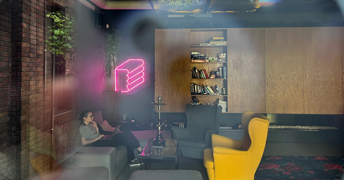
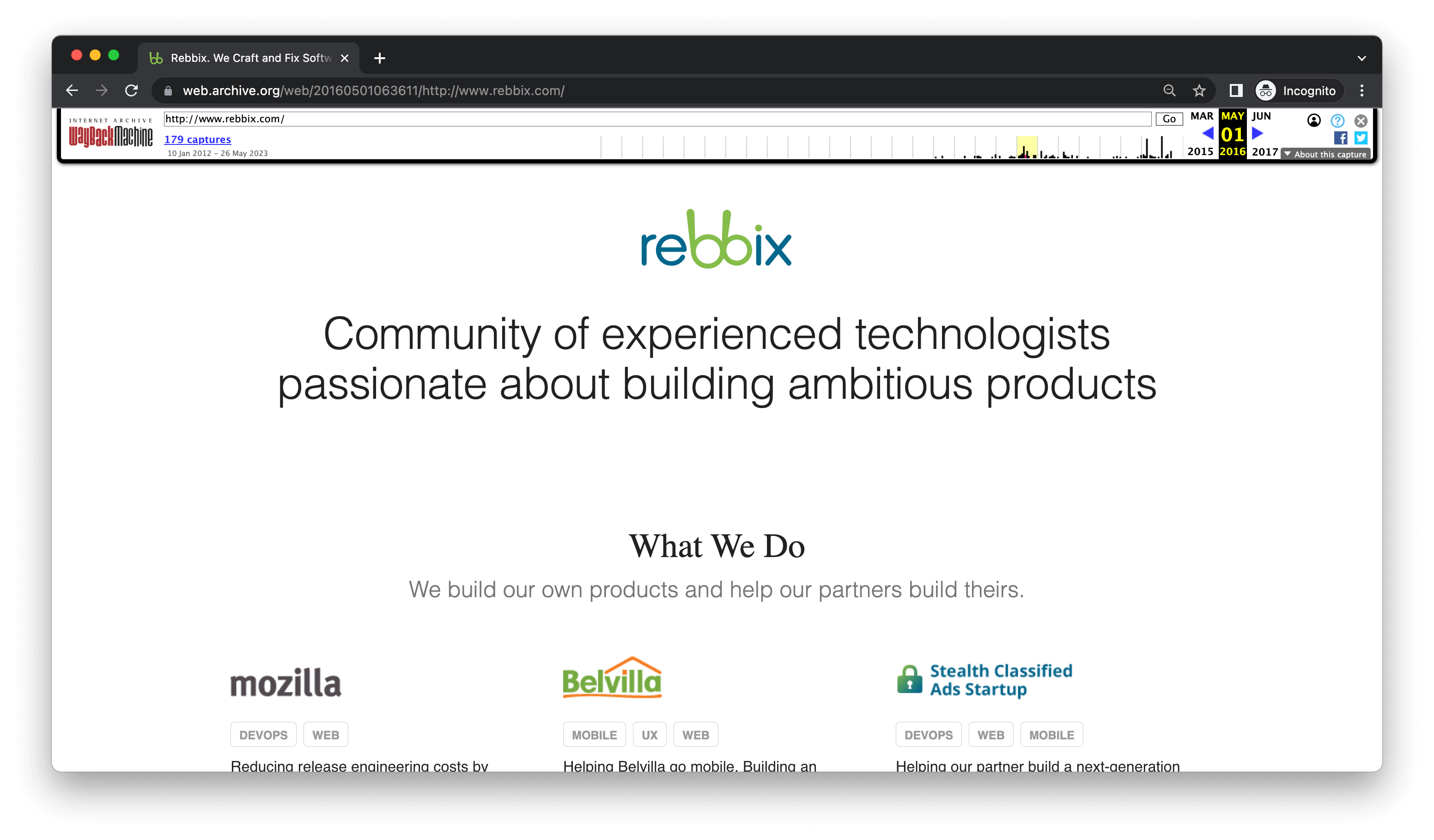
At the end of June, a Lviv-based tech company Rebbix announced its rebranding. It’s the first major overhaul of the company’s visual identity since the time it was founded in 2012. Continue reading to find out how a brick of pink modeling clay appeared on the company’s logo and what values Rebbix wants to communicate with the help of the new look.

Rebbix was founded in 2012 by Oleksij Rak and Serhiy Oplakanets. Having spent years at a large tech corporation overwhelmed by far too many bureaucratic processes, they decided to build their own team of product experts who would value straightforward communication and truly meaningful work over everything else.
This idea is still at the heart of Rebbix, but its branding, which also hasn’t changed since the company’s foundation, needed a refresh as it no longer reflected all the growth and development that have taken place in the 11 years of Rebbix’s operation.

The new visual identity had to help the company reach two main goals. The first one was to stand out from the competition. A small internal research showed that one sure way to achieve this goal was through color, and that color was pink. It’s not common among engineering companies, and that’s exactly why the Rebbix team loved it. The second goal was to capture the spirit of Rebbix
“All our employees are strong product experts and engineers, but what’s most important is that we all genuinely like working on the products we take on. We enjoy all the experimenting, trying, failing, and succeeding that happens in the process of building our clients’ products. That’s why we really didn’t want our brand to give off that ‘sterile,’ professional, respectable feel,” says Serhiy Oplakanets, Rebbix Co-Founder.
This combination of solid expertise, hands-on approach, and fun-loving essence had to be at the base of Rebbix’s new brand. The company enlisted the help of the creative agency and action and after a few branding sessions landed on a concept that met their needs perfectly. And so, the central element of the new Rebbix branding became pink modeling clay.
Not an obvious choice, and yet, modeling clay is a fun and simple material which, despite its seeming silliness, is widely used in various professional contexts, including car prototyping.

Modeling clay is the perfect visual cue for something that’s both unserious and professional. It fits right in with the down-to-earth vibe of Rebbix.
Besides, the flexibility and applied nature of this material happen to work well to symbolize Rebbix’s key expertise, which is building engineering teams that are all different but always exactly right for the specific product challenges of the company’s clients. These include launching new products, pivoting, finding product-market-fit, scaling, and reaching millions of users.
In addition to everything mentioned above, modeling clay lands itself nicely for creating a large variety of brand visuals — you can make anything out of modeling clay.

Rebbix’s rebranding also included the design and development of a new website with the support of the Happy Design studio.
The Rebbix team is happy that they can now communicate their values more effectively through the new visual identity and voice and hope to build even more lasting connections with clients and employees with their help.
At the end of June, a Lviv-based tech company Rebbix announced its rebranding. It’s the first major overhaul of the company’s visual identity since the time it was founded in 2012. Continue reading to find out how a brick of pink modeling clay appeared on the company’s logo and what values Rebbix wants to communicate […]
https://itcluster.lviv.ua/wp-content/uploads/2023/07/cover-rebbix-rebranding-_-lviv-it-cluster.jpg